
Specialty Paper: The Detail That Makes a Printed Piece Feel Luxurious
A guide to choosing paper that does more than carry the print.
When people look at a beautiful invitation or printed piece, they usually notice the color first, or the typography, or the artwork. But before any of that registers, they feel the paper.
Specialty paper is what gives a printed piece presence. Soft and cottony, lightly textured, beautifully thick, subtly shimmering, handmade in feel, or smooth and refined — the right choice turns a design into something a guest wants to keep.
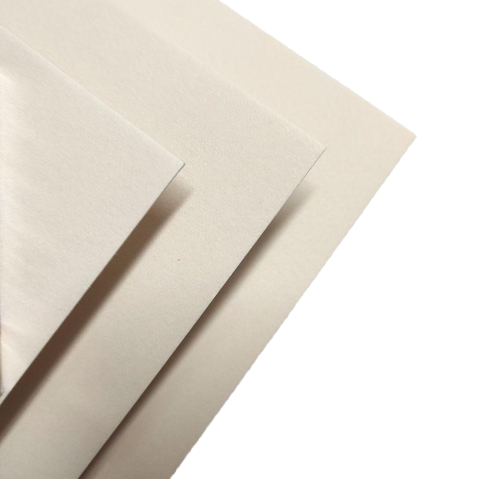
What Makes Paper “Specialty”?
Specialty paper is any stock chosen for more than what it prints on. Its texture, weight, color, finish, and fiber become part of the design itself.
Unlike a standard smooth cardstock, specialty papers may carry a visible tooth, a deckled edge, a soft cotton finish, a pearlescent sheen, or a rich colored core. Each creates an impression before a single word is read.
The paper is the first thing anyone reads — before the words.
A Quick Guide to Specialty Papers
| Paper type | Feel | Best for |
| Cotton | Soft, tactile, timeless | Letterpress, foil, wedding stationery |
| Textured (linen, laid, eggshell, felt) | Subtle dimension, understated | Elevated pieces that aren’t overly formal |
| Pearlescent | A delicate shimmer that catches light | Evening events, menus, celebratory pieces |
| Handmade / deckle-edge | Organic, uneven, artisanal | Watercolor artwork, florals, one-of-a-kind pieces |
| Colored & duplex | The color is the design | Bold color moments, branded suites |
The Specialty Papers We Reach For Most
Cotton paper
Soft, tactile, and timeless. Cotton paper is especially beautiful for letterpress, blind debossing, foil, and wedding stationery. It carries an understated luxury that never feels trendy.
Textured paper
Linen, laid, eggshell, and felt finishes add subtle dimension to a printed piece. They’re ideal when you want something elevated but not overly formal.
Pearlescent paper
A delicate shimmer catches the light and gives menus, invitations, and event pieces a dressier finish. It works beautifully for celebrations, evening events, and designs with a romantic or polished feel.
Handmade and deckle-edge paper
Naturally uneven edges and visible fibers create an artisanal, organic look. It’s a beautiful choice for watercolor artwork, soft floral designs, and pieces meant to feel one-of-a-kind.
Colored and duplex paper
Sometimes the paper color is the design. Rich burgundy, warm ivory, deep navy, soft blush, or a contrasting colored edge can create a memorable result with very little printing.
Why Paper and Printing Method Have to Be Chosen Together
Paper should always be selected alongside the printing process, not after it. A thick cotton stock can take a beautiful deboss, but a heavily textured sheet may not hold fine type as sharply as a smooth paper. Foil can look crisp and luminous on one paper, and softer, more organic on another.
At Embossed Studio, we consider the full combination: the artwork, the level of detail, the printing method, and how the finished piece should feel in someone’s hands.
The paper and the process are one decision, not two.
The Right Paper Changes Everything
A simple design printed on a beautiful sheet can feel more luxurious than an elaborate design on ordinary cardstock. Paper adds quiet dimension — it makes colors feel warmer, impressions feel deeper, and a finished piece feel intentional.
Whether you’re creating wedding invitations, a brand stationery suite, event menus, packaging, or personal stationery, specialty paper is one of the most meaningful ways to make the final piece feel considered.
Because beautiful printing shouldn’t only be seen. It should be felt.
Common Misconceptions
“Thicker paper always looks more luxurious.”
Not for a delicate deckle-edge piece or a soft-fold menu. Weight is one part of the feel — texture, coating, and finish carry just as much of it.
“Any specialty paper can take foil or an emboss.”
Heavily textured or uncoated sheets can resist foil, and brittle stocks can crack under a deep impression. The paper has to suit the technique, not just the look.
“Texture and color are decoration, not design.”
Often the paper does more work than the print sitting on it. A colored core or a visible fiber can carry a design on its own.
Frequently Asked Questions
What is specialty paper?
Any paper chosen for qualities beyond standard printing — its texture, weight, color, fiber, or finish — so the stock itself becomes part of the design.
What is the best paper for wedding invitations?
Cotton and duplex stocks are longtime favorites for their weight and texture, though pearlescent and deckle-edge papers work beautifully depending on the occasion and design.
Can any paper be foil stamped or embossed?
No. Smoothness and coating affect how foil adheres, and a sheet’s pliability determines how cleanly it takes an emboss or deboss. The paper and the finish need to be matched.
What’s the difference between cotton paper and regular cardstock?
Cotton paper is made from cotton fiber rather than wood pulp, giving it a softer hand, more texture, and a quieter, more tactile finish than standard smooth cardstock.
Does the paper affect the cost of a printed piece?
Yes. Specialty stocks, duplexing, and certain finishes carry different costs than standard cardstock. It’s part of what we help you plan for during sourcing.
Not sure which specialty paper is right for your project?
Embossed Studio can recommend a stock based on your design, the finishing technique, and the feeling you want the piece to carry — not texture alone.
Start a project →